Panda Basket
design & development · ios · shipped june 2026
Panda Basket (パンダかご) is an iOS app for people who cook for themselves and keep losing track of what's in the fridge. You talk, snap a receipt, or paste a link; AI turns that into inventory, recipes and a week of meals, and deducts the ingredients once you've cooked. All of it stays on the phone — no account, no server holding anyone's groceries. I designed it, built it, put it on the Japanese App Store in June 2026, and still run everything around it: the listing, the site, the marketing.
This page is about the decisions rather than the feature list. The product site has the feature list.
-

link import
-
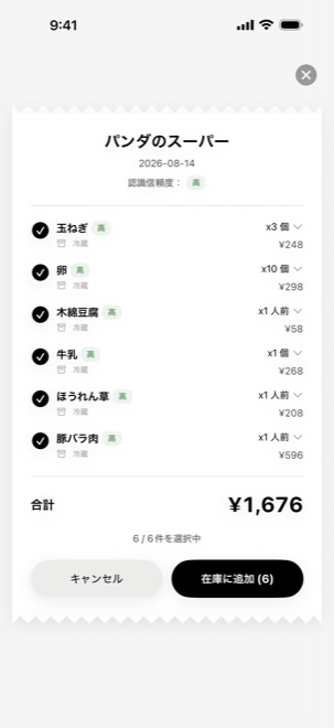
receipt capture
-
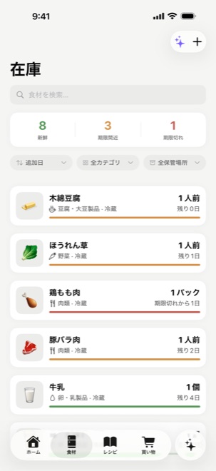
inventory
-
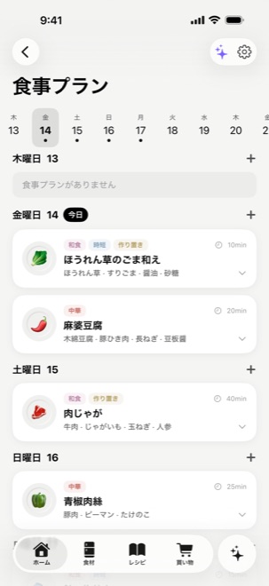
meal plan
Typing is where food apps die
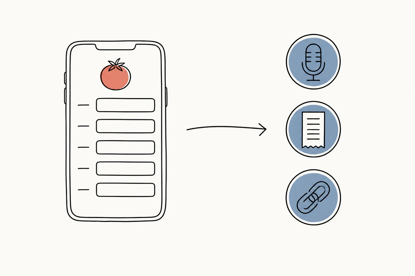
Every fridge app I'd tried died the same way: it asked me to type. Name, quantity, unit, category, expiry date — five fields per tomato. Nobody keeps that up past week two, and an inventory app with a stale inventory is worse than no app at all.
So there are three ways in, and none of them is a form:
- Say it. "A bunch of spinach and two cartons of milk."
- Snap the receipt. AI reads the items; anything wrong is one tap to fix.
- Paste a link. A recipe you found on social or a cooking site comes back as structured ingredients and steps.
The cost of that shows up in the data immediately. If people can say "a bunch of spinach" or "one portion of pork," the database fills with quantities no program can do arithmetic on. The conventional fix is to force everything into grams and millilitres at entry — which just hands the typing back to the user. I decided to store the mess as it comes and defer the interpretation to the one place it actually matters: the moment you ask what to buy.
That handed a maths problem to a language model. It went badly.
The model that couldn't subtract
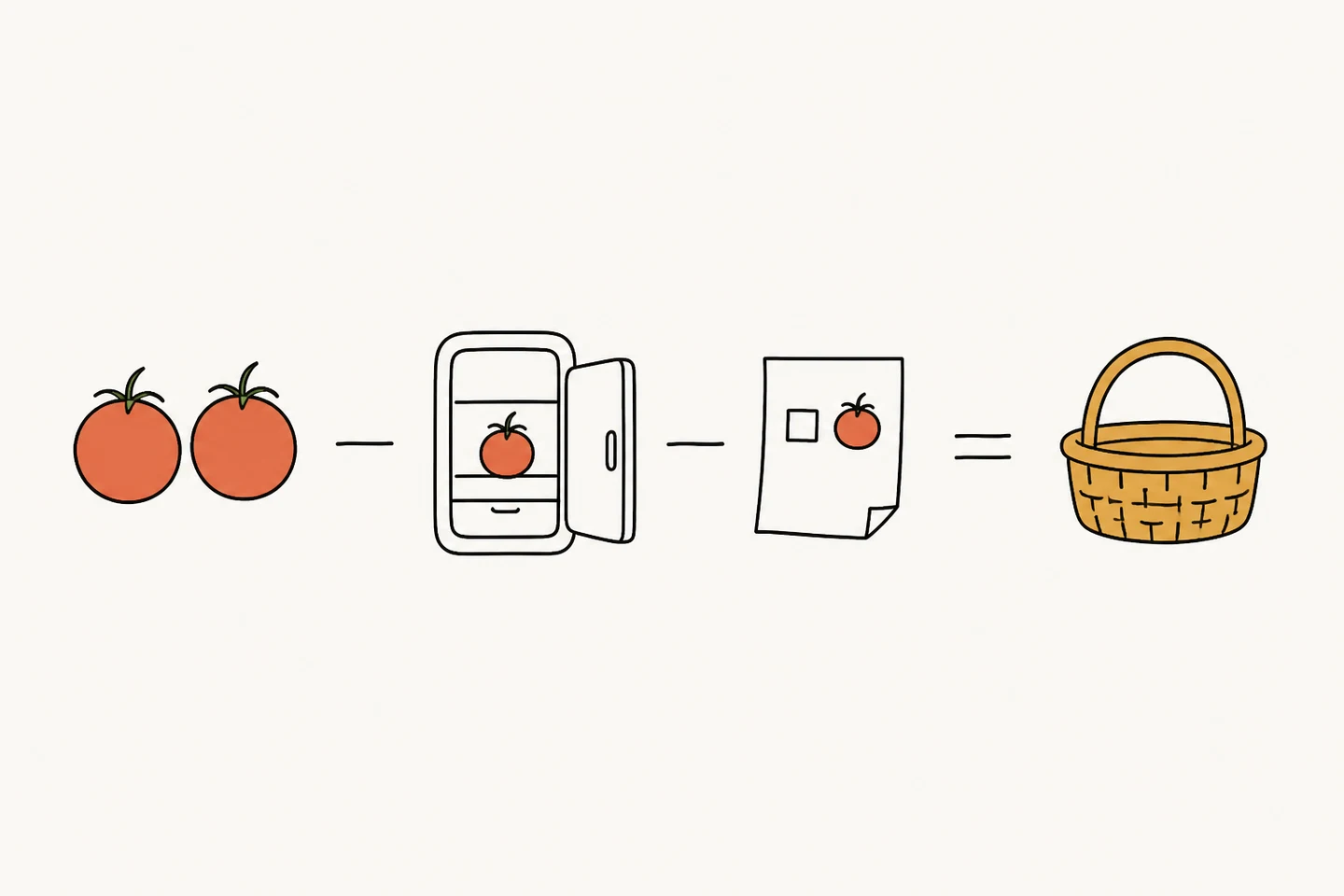
A shopping suggestion is a subtraction: what the meal plan needs, minus what's in the fridge, minus what's already on the list. Need two, have one, one already listed → suggest nothing. The first version confidently suggested one more.
Three things were wrong, and I found them in the wrong order.
- The model. Estimating "one portion of pork" as roughly 300 g and then doing multi-constraint arithmetic on top of that estimate was past what the fast model could hold. Swapping that single endpoint to the reasoning model fixed the arithmetic — the upside of an AI-heavy architecture is that a capability upgrade is a config change, not a refactor.
- A timeout I'd hardcoded months earlier. The better model was slower, and every request now died at the 30-second limit I'd set on the request. Sixty seconds, gone.
- My prompt. Even on the strong model it kept padding the list with things the plan didn't need, justified as "goes well with this" or "you're running low." I'd written a greedy prompt: expiry dates, the local recipe library, five competing reasons something might be worth buying. I deleted all of it and left one instruction — needed, minus in stock, minus already listed. The padding stopped.
The lesson I keep re-learning: for anything with an exact answer, context isn't free. Every extra thing you hand the model is one more thing it can decide to optimise for instead.
Waiting needs a shape
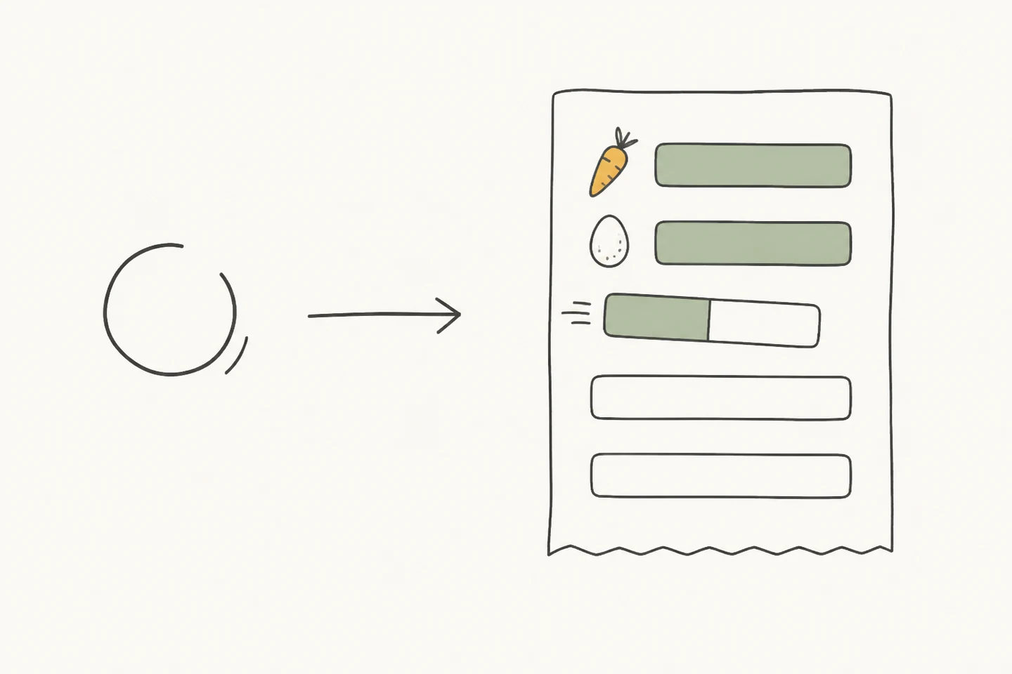
Every AI action in the app costs somewhere between two and fifteen seconds. A spinner held over that interval doesn't say "working," it says "possibly broken."
Receipt scanning got the literal treatment. The model emits one JSON object per line, the Worker passes the stream through as server-sent events, and the client parses each line the moment it completes — so items land in the list one at a time while the model is still reading the bottom of the receipt. You watch it work instead of watching a circle.
The flows that can't show a partial answer get staged text over a skeleton of the result: three or four phases naming what's actually happening, rotating every two to three seconds.
My favourite rule in that system is the one that makes the app slower. If a phase has been on screen for less than two seconds when the result arrives, the UI waits until it has had its two seconds before switching. A message you couldn't finish reading is worse than a slightly longer wait — it reads as a glitch, and a glitch costs more trust than three seconds ever will.
Perceived time and real time are different quantities, and only one of them is the user's problem.
Grams, and two thousand taps
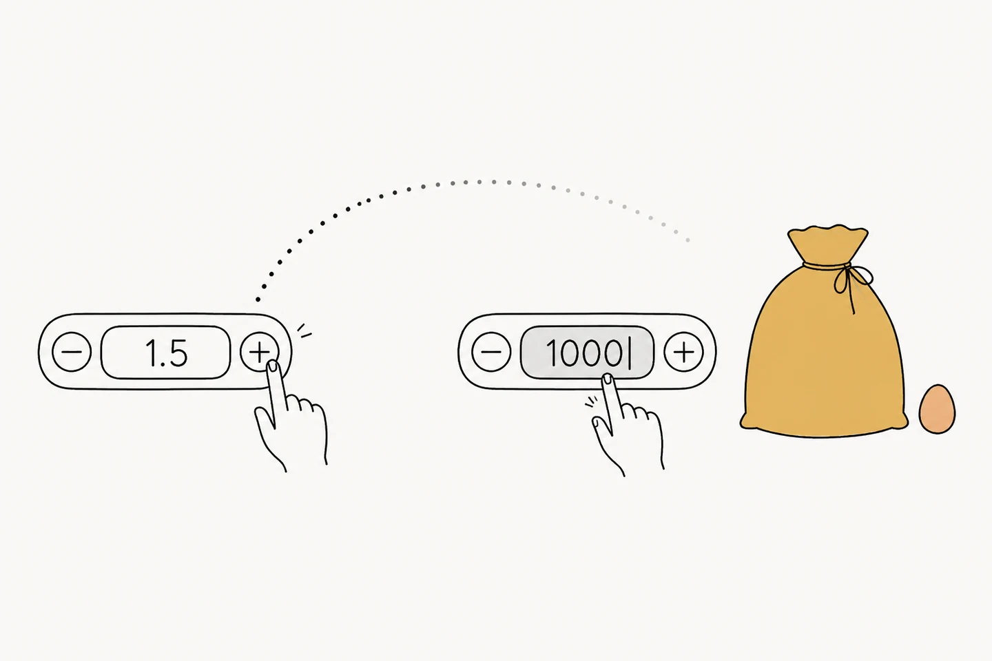
AI gets things wrong, so every result it produces has to be editable, and editing quantities lands on a stepper. Mine had a step of 0.5 — a number I picked while thinking about portions and then never revisited.
Then somebody buys a kilo of flour. Getting to 1000 g at half a gram per tap is about two thousand taps.
The obvious fix — a bigger step — breaks every other unit; nobody buys eggs in increments of a hundred. The actual fix was to stop treating it as one gesture. The +/− buttons stay, for nudging. Tapping the number itself turns it into a text field with a numeric keypad, for the kilo of flour. And the step stopped being a constant: it comes from the unit — 100 for grams, 1 for portions, 1 for pieces.
The component itself still knows nothing about food. It takes a step and a range, and the caller decides what a sensible increment is, which is the only version of that control I'd be willing to reuse anywhere else. A numeric control shouldn't assume the magnitude of what you're entering.
The grid died in user testing
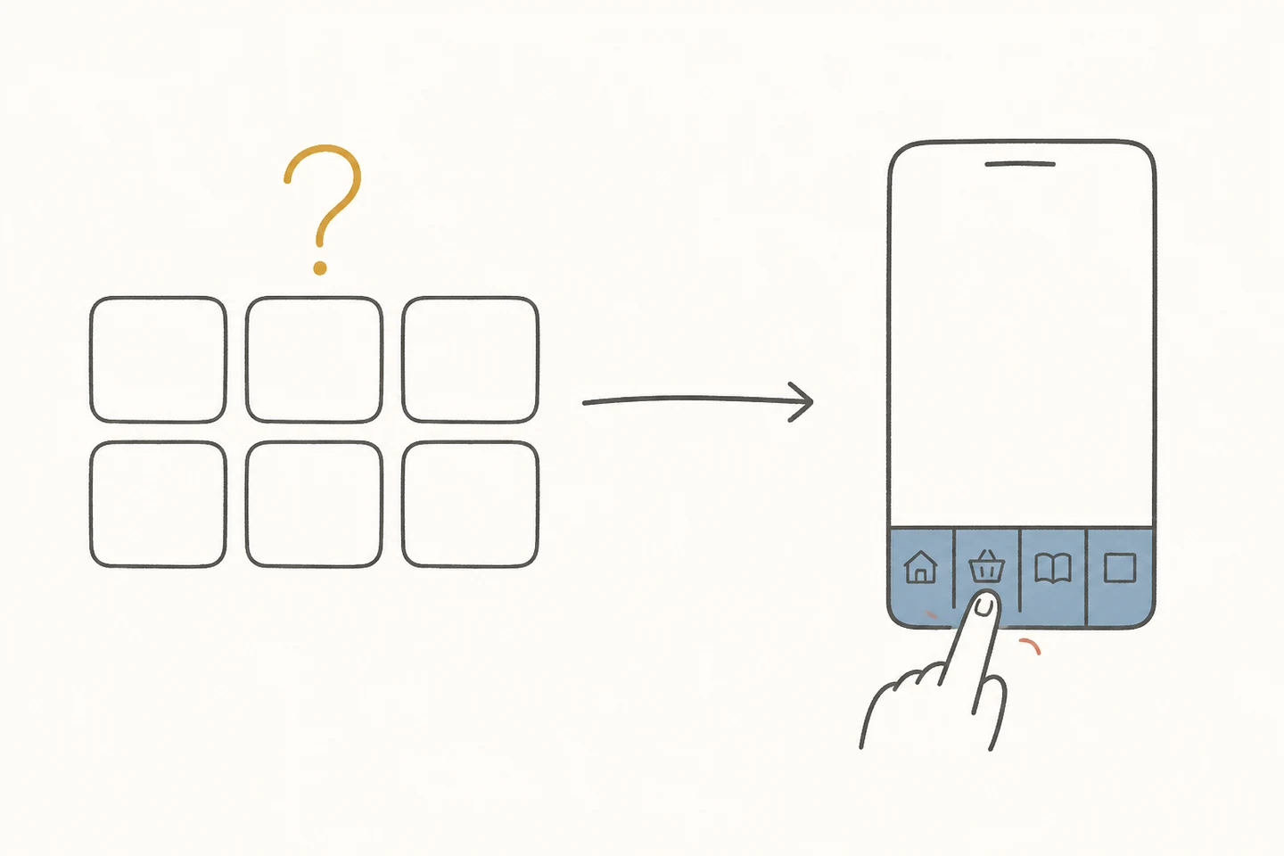
The first version had one destination: a home screen of navigation cards, everything a tap away, no tab bar. Clean on paper.
I handed it to friends. They'd open it, look at the wall of cards, and ask me what they were supposed to do. A grid of equal-weight entry points doesn't tell you where to start — it asks you to arrive with a plan.
A tab bar fixed that, for a reason that has nothing to do with efficiency: people poke at tabs. Four labelled compartments get explored one by one, on the first evening, without anyone deciding to explore them. A card grid gets read instead, and reading is a decision.
The cost is on the home screen right now — four of its cards lead to the same places the tabs do. Two routes to one destination, exactly the kind of redundancy I'd flag in someone else's app. It's a transitional state I'm keeping on purpose: now that navigation belongs to the tabs, the home screen should hold content — what to cook tonight, what's about to go off — rather than doors. That rewrite hasn't happened yet.
Colour comes from the food
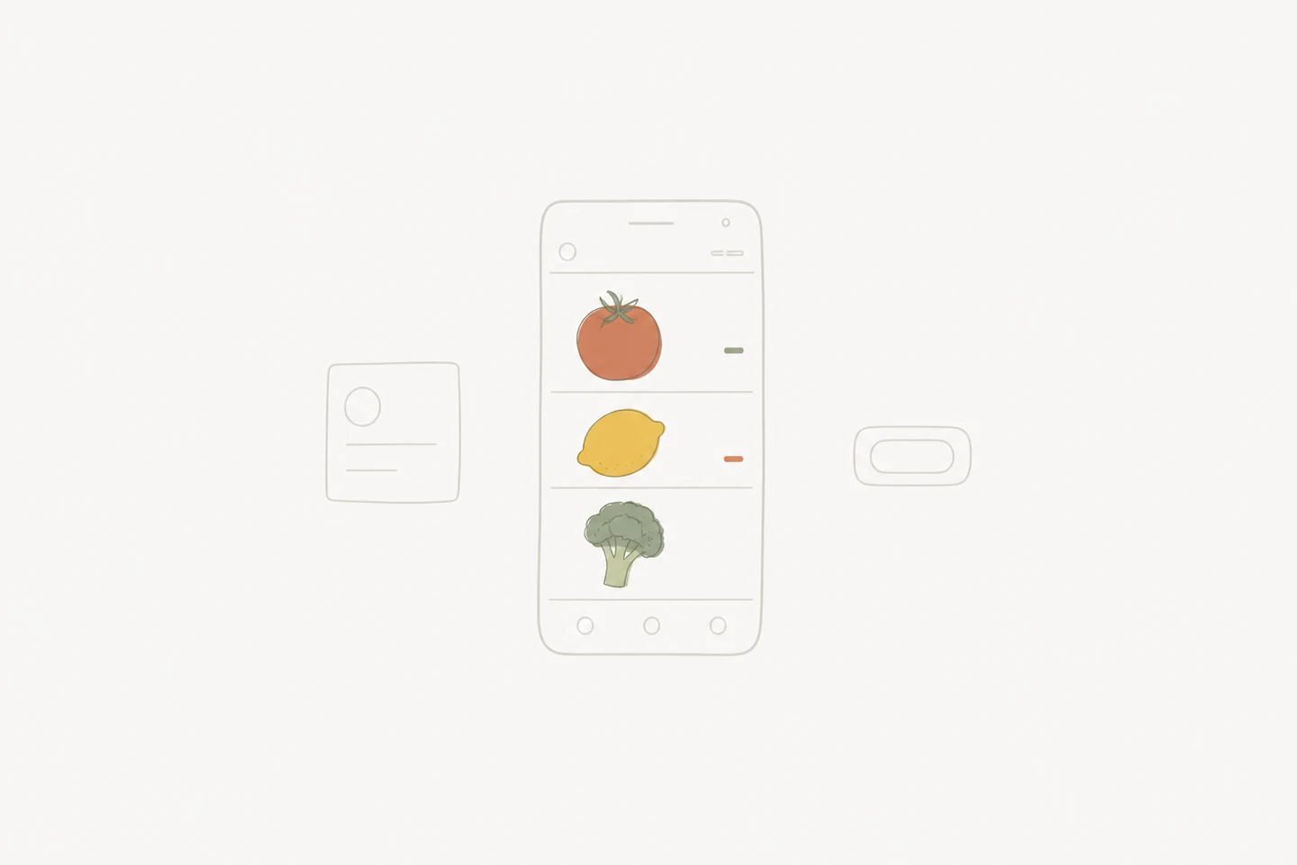
The app started out indigo, like every other productivity app. In April I took all of it out: black, white and grey for structure, colour only where colour is information — the food's own emoji and photos, and a low-saturation cue on the expiry bars.
Two reasons. Food is loud, and a coloured interface competes with the one thing users came to look at. And fresh / expiring / expired is the single state in the app that has to read from across the room, which only works if nothing else in the frame is arguing for attention.
The site you're reading is the same instinct, minus the food.
Deleting sync in order to ship
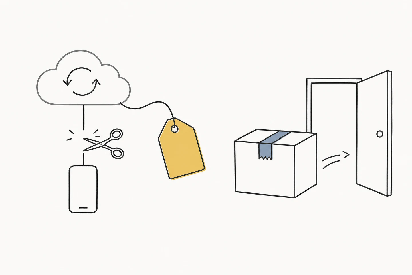
Sign in with Apple and CloudKit sync were built, working, and sitting in main. On 1 June 2026 I deleted them.
The version I could ship was the single-device one, so the real question was how to park the sync work. The instinctive answer is a feature flag: leave the code in, switch it off, flip it back when you're ready. I removed it instead, tagged the commit, and wrote down how to rebuild it.
A flag only protects what the compiler checks. Type contracts survive; CloudKit's rules don't. Its schema constraints — relationships must be optional, no unique attributes, non-optional properties need defaults — are enforced only when you actually run against a CloudKit container. Behind a switched-off flag you can violate every one of them and the build stays green. And because the sync service enumerated its models by hand, any model I added afterwards would silently miss the sync path with nothing to complain about it.
That wasn't hypothetical. When I sat down to make the call, the sync design doc listed nine models and the code had eight. The list had already drifted while nobody was looking. Flags rot quietly in exactly the places you can least afford it; a git tag doesn't rot at all. And when sync comes back it should be redesigned against whatever the data model looks like then — not merged from a branch that stopped thinking in June.
Ten days later, v1.0 was on the App Store.
Metering AI without punishing curiosity
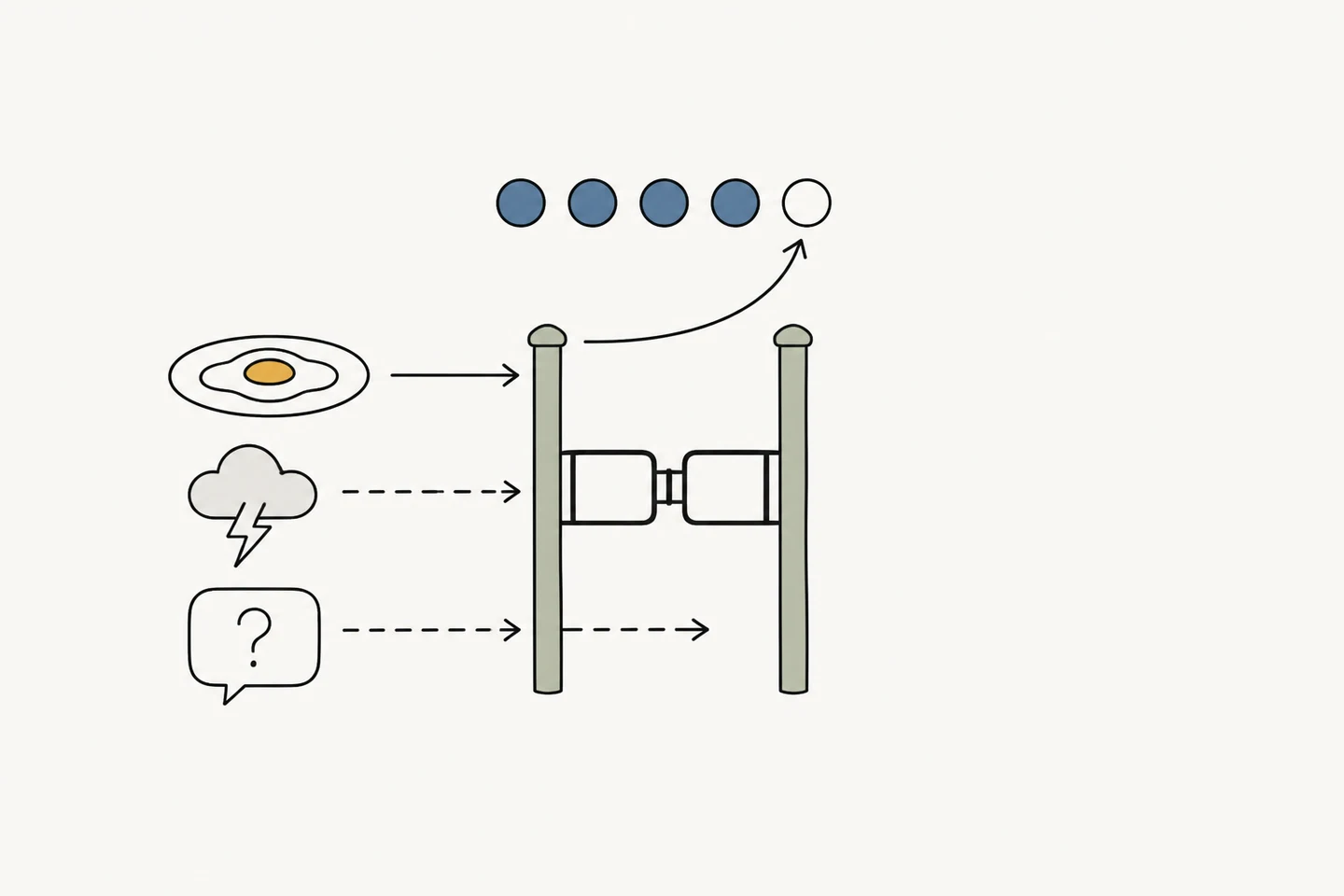
Every AI call costs me money, so the app gives you five free AI uses and then asks you to subscribe. Five is a small enough number that where you count matters more than the number does.
The obvious place to charge is the gate — user taps an AI button, decrement. But most of those buttons open a sheet rather than fire a request, so you'd lose a try by opening the camera and changing your mind. The other obvious place is the network layer, except one action can fan out into several model calls, and a week of meal plans would quietly cost four or five.
So the counter sits at the result: it decrements when the app puts a usable result in front of you, exactly once per action. Errors don't count. Clarifying questions don't count. "I couldn't read anything in this photo" doesn't count. Regenerating inside the same session doesn't count either.
It's more code than a decrement in a button handler. It's also the difference between metering the value and metering the attempts.
One lane out
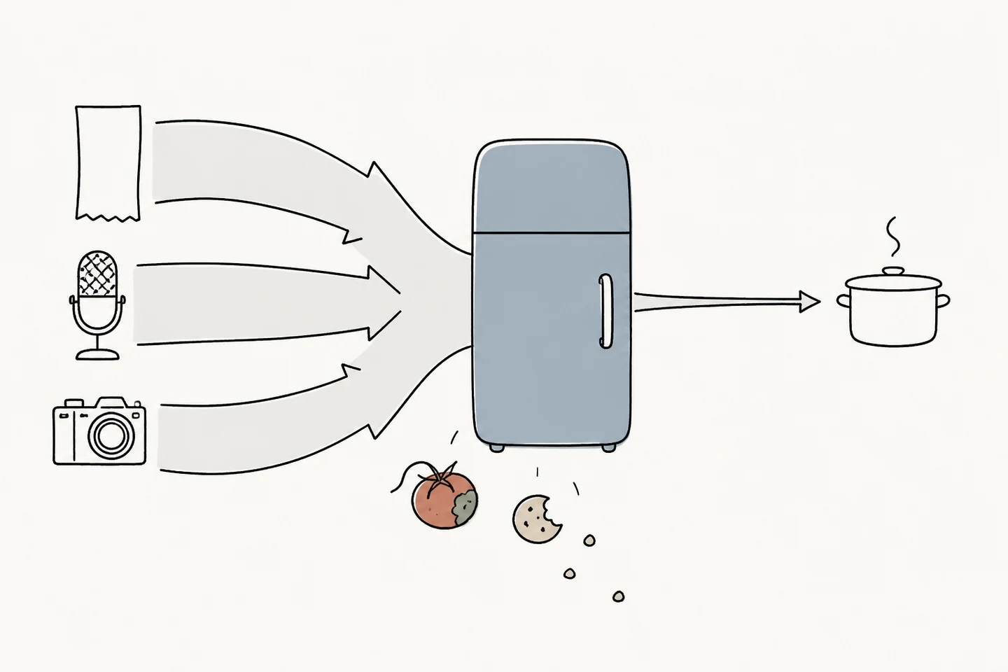
Three AI channels in — receipt, voice, photo. One way out: you tell the app you cooked something and it deducts the ingredients. That asymmetry is the app's structural weakness, and I don't have a fix for it.
Everything that leaves a real kitchen unlogged — snacking, a tomato gone bad, a portion that was really one and a half — accumulates as drift. Inventory apps don't fail loudly. They fail by degrees, until the list on screen is fiction and you quietly stop opening it. A lying interface is worse than no interface.
The suggestions I've been given are all reasonable. Drop the precision — make the primary fact "bought on the 5th, use it soon" instead of "300 g left," which is immune to drift by construction. Auto-decay stale items into a "still there?" pile. Run a weekly thirty-second count, two buttons per item.
I haven't shipped any of them. My position, for now, is that drift is a property of any system with a non-zero cost of logging, and the honest moves are to keep lowering that cost and to nudge before things expire — not to add machinery that makes a wrong number look tended. I'd rather ship something visibly approximate than something that performs accuracy.
That's the open problem. If there's ever a second version of this page, it's probably about how I solved it.
- Role
- Design, development, release, marketing — solo
- Stack
- SwiftUI · SwiftData · Cloudflare Workers · Gemini
- Platform
- iPhone, iOS 17.2+
- Languages
- 日本語 · English · 简体中文 · 繁體中文
- Timeline
- First commit Jan 2026 · v1.0 shipped Jun 11, 2026 · v1.1 (link import) Aug 11, 2026